One Flower, Three Levels of Difficulty
- Shayda Campbell

- May 14, 2021
- 6 min read

When it comes to our drawing practice, we are all at different stages, so today we are approaching a peony illustration from three different levels and you can try one or all of them. Peonies are fluffy, frilly flowers that have layers and layer of petals and that can be a little intimidating. I thought it would be fun to approach the illustration in three stages. The beginner level is a basic doodle, and then I'll take it a little further to be a little more realistic and artful, and a little further again for a more advanced drawing with depth and shading. You can simplify a flower or anything you want to draw, and that is a comforting thing as an artist.
Follow along with all three steps in the video:
Shop My Supplies Here:
*Disclosure: I only recommend products I would use myself and all opinions expressed here are my own. This post contains affiliate links from which, at no additional cost to you, I earn a small commission from.

With our level one illustration it is all about simplifying the flower and capturing some of its essential elements, such as the tightly clustered inner petals and large fluffy outer petals. I am beginning with a circle, and dividing it into four sections to make my center petals. The stamen in the center is a collection of little dots. Then I will start to incorporate some larger petals, overlapping them and getting larger as you go out. The peony is known for those big beautiful buds so I will add one of those off the curving stem. My trick for drawing leaves is to start with an oval shape and then once you have that sitting where you want it go around and add a little detail like scalloped or toothy edges.
With my Molotow black liner I'll start going over everything in pen. This has the 04 nib so it is precise but has a good weight to it. As I go over the petals, I wiggle the pen a little bit to capture another key element of the peony: the petals have a very ruffled, sort of broken, edge to them. Even though the illustration is simple, we capture those details that let the viewer know that this is a peony. Once I get rid of all my pencil markings I am going to use a pen with a smaller nib to add just a little bit of shading. For our first illustration though, that is it! It is all done and looks super cute.

Our level two peony is going to be drawn on an angle so it will look a little more three-dimensional. I am starting with the stamen, which is still a cluster of messy dots in an oval shape. To create a guide, I sketch an oval around them and turn it into a shallow bowl. I divide the front of the bowl into the three center petals, and the back into three petals just peaking out to create those tightly clustered petals. Now we start adding the rest of the petals, which are peeling away from the center and getting a bit larger. However, the ones at the back are a little smaller where they are just peaking out, and the ones at the bottom are larger. To make it look like the petals are curling a bit, I'm adding an extra line to some so we aren't just looking at a bunch of flat petals.
It has the same curving stem and leaves, but the bud on this one is a little more open and intricate. I start with a circle again, but right away I add two petals that are falling away from the circle with a little space in between. The rest of the bud you divide into three or four petals and add a little scribble to the top.
Going over it in pen I am accentuating all of those details, like thickening the outer lines on the petals where they curl inwards. I am really shaking the pen, creating little indents, to show the ruffled edges of the flower. I am checking constantly and reevaluating to see if the flower is balanced, adding an extra petal or thickening a line where it is needed. After removing the pencil lines and cleaning it up, I want to darken the stamen in the center, but am going to leave it as a beautiful contour drawing.
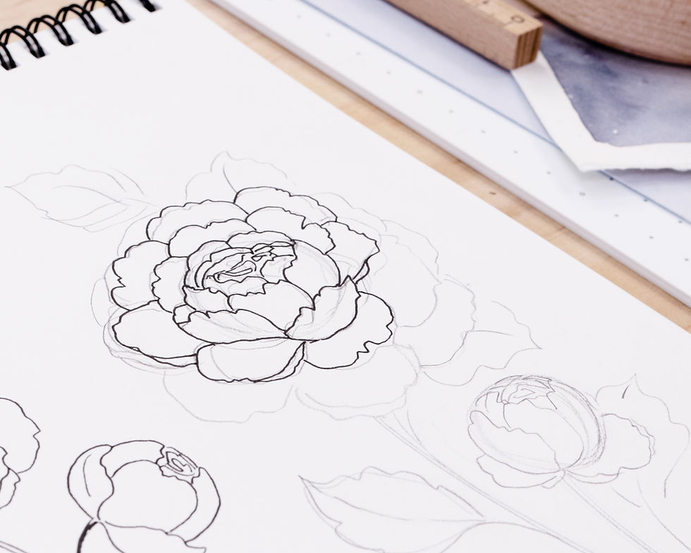
Level three looks a little complicated, but it is a lot of fun to draw this way. It is a contour drawing just like number two before we add the shading. I start with a circle, almost like the bud in level two, with one petal in the middle and two on the sides. I'm tucking some more in behind to start creating those layers and layers. For the center you can scribble a messy spiral, or scribble a flower shape, and both will give the look of a really tight cluster of petals. We don't want it to look like a perfect circle so I am reshaping the petals before adding the outer petals.
The front petals curve up towards center, and the back petals just peak out where we can see the top of them. As the petals get larger, they are falling away from center, towards the bottom of the page. So far this has been really similar to level two, so stick with it if you were comfortable with the last illustration! The stem and leaves are still sketched out the same as in level one. The bud starts the same as level two with the two petals falling away and the inner circle divided into three petals. This time I've added an extra petal and an extra leaf.

Just like the other two, it is time to go over everything in pen. Again, I really want to capture those ruffled, broken edges to the petals. One part of this advanced illustration that really shines, is all the detail at the center of the flower - it really makes it jump off the page. Instead of all the dots there are even more layers or petals before that little scribble in the middle. Just like in level two, remember to add that extra line to some of the petals to make it look like they have a bit of curve to them. It adds to the shape and organic look of this big beautiful flower.
Drawing level one and two helped me get to this stage - by spending time thinking about what makes a peony, what are its key features, what can I capture, and what can I advance as I move into the next level of illustration. Giving the center more detail adds to the realism, and the extra leaves add perspective and the three-dimensional look of a more intricate drawing. At this point we have another beautiful contour drawing, but I am going to grab a smaller nib again and start shading.

Adding shading to a pen illustration is a great way to add depth and dimension, and can also hint at the texture and shape of the flower, or of each petal and leaf. What I am thinking about first of all, is where is this flower going to be darker? If the light is shining from above, I know that each petal will be darker towards the center of the flower where the light can't quite hit. I add shading to the bottom of the petals, anywhere there is a bit of curvature, and I am thinking about the shape of every petal, so the lines are following in the same direction. I am also adding lines at the top of the petals to hint at that ruffled texture and the nature of the peony.
The leaves, I am going to add shading and make much darker. Another thing we can achieve with line shading is contrast - what is flower and what is leaf. I started by using the same line shading and principles on the leaves, but now I want to darken them to differentiate them. Even though this is a black and white drawing, I want to be able to tell what would be green and what would be pink or white. For more in-depth shading tips you can watch the video, or check out this video on pen shading.
The shading helps the peony just jump off the page. We are seeing the flower on an angle, are capturing all the key features of a peony, and not only have we done an intricate contour drawing, but have gone all out with the line shading to add contrast, depth and texture. I hope you can see the progression, and feel more comfortable trying all three of the illustrations!


Comments